
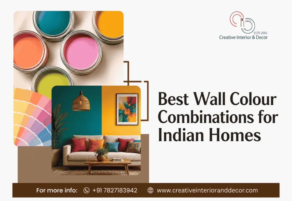
Walk into any home and the very first thing that registers, often before the furniture or the layout, is the colour on the walls. Wall colours set the tone for how a space feels and play a fundamental role in interior designing. They can make a small bedroom feel airy, a large living room feel cosy, or a dull hallway feel alive. Choosing the best wall colour combinations for Indian homes is not just a design decision, it is an emotional one.
In modern interior designing, the right colour palette works in harmony with furniture, lighting, and décor to create spaces that are both beautiful and functional. The right palette can lift your mood every time you walk in, while the wrong one can make even a beautifully furnished room feel flat or uncomfortable.
In this guide, we will walk through everything you need to know before picking your next wall colour combination, from understanding light and room size to choosing finishes, avoiding common mistakes, and exploring some of today’s most loved colour pairings for Indian interiors.
Why Wall Colour Choices Matter So Much
Wall colour does more than decorate. It directly affects how spacious, bright, or warm a room feels. Lighter shades visually expand a room, while deeper tones add intimacy and depth. The colours you choose interact constantly with several factors:
- Room size: Compact rooms generally benefit from lighter, brighter shades that prevent the space from feeling boxed in, while larger rooms can carry richer or deeper colours without feeling overwhelming.
- Natural and artificial lighting: A colour that looks soft and warm in daylight can appear completely different under yellow tube lights or cool LED lighting in the evening. Always test a shade under both conditions.
- Interior design style: A minimalist home calls for muted, calm palettes, while a maximalist or eclectic home can carry bolder colour pairings with confidence.
- Furniture and décor: Your wall colour should complement existing furniture, curtains, and flooring rather than compete with them.
- Climate and regional preferences: In hotter regions of India, cooler tones such as blues and greens are often preferred for their visually cooling effect, while in colder northern regions, warmer earthy tones are popular for the cosiness they bring.
Understanding Colour Psychology Before You Pick a Shade
Colour psychology plays a quiet but powerful role in how a room feels to live in.
- Blues and greens are calming and restful, ideal for bedrooms and spaces meant for relaxation.
- Yellows and oranges are energising and cheerful, suited for kitchens, dining areas, and children’s rooms.
- Reds and deep maroons are intense and stimulating, best used sparingly as accents rather than across an entire wall.
- Neutrals like beige, grey, and white are versatile and timeless, working well as a base in almost any room.
- Earthy tones like terracotta and ochre bring warmth and a grounded, homely feel that suits Indian interiors particularly well.
Keeping this psychology in mind while selecting your home wall colour design helps ensure each room supports the activity it is meant for, whether that is rest, focus, or social energy.
10 Best Wall Colour Combinations for Indian Homes
1. Soft Sage Green with Warm White
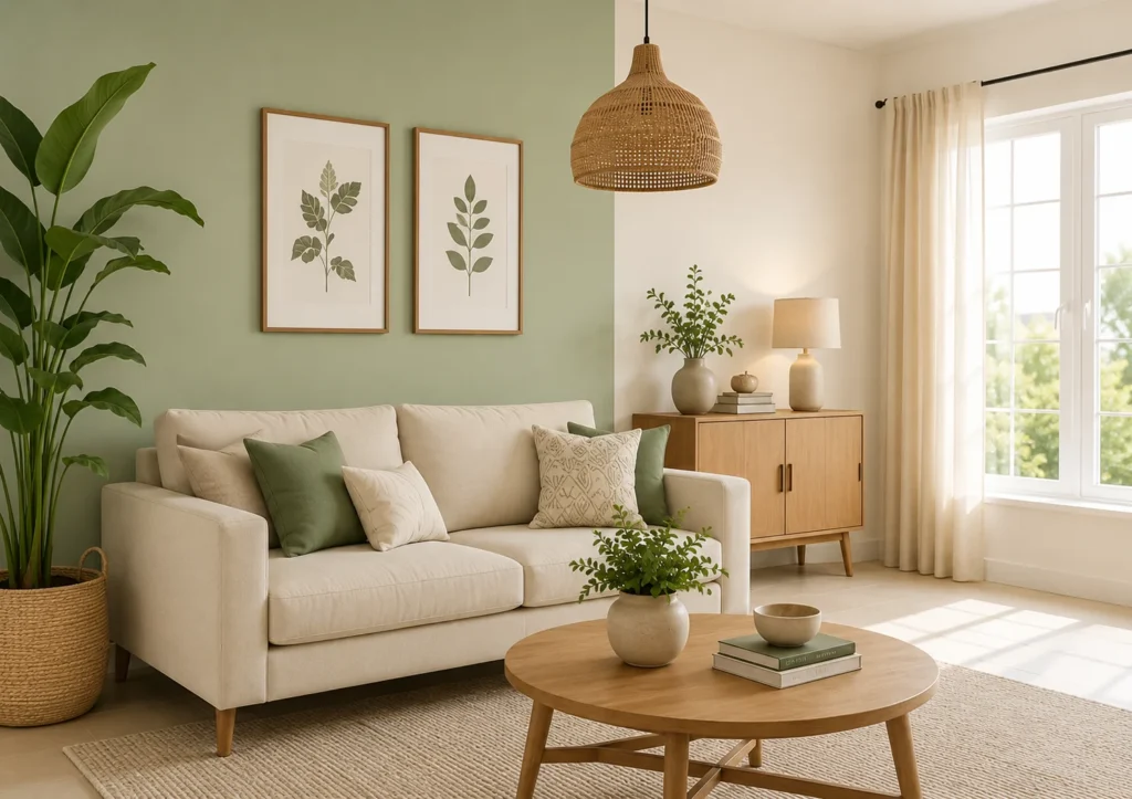
The bed is the anchor of any bedroom. For toddlers, a low-profile bed or floor mattress eliminates fall hazards. For school-age children, a This pairing feels fresh without being cold. Sage green works beautifully on a single accent wall while warm white covers the rest, creating balance. Ideal for living rooms and bedrooms, it pairs well with wooden furniture, jute rugs, and rattan accents.
2. Terracotta with Off-White
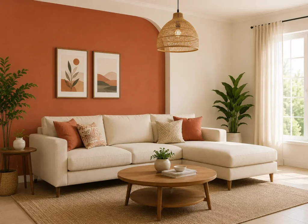
A favourite among lovers of earthy tones, terracotta adds warmth and character while off-white keeps the room from feeling too heavy. Works wonderfully in living rooms, balconies, and dining spaces with wooden or cane furniture.
3. Greige and Charcoal Accent
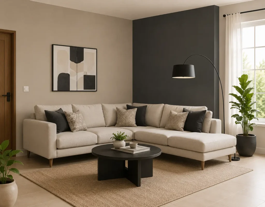
Greige, a blend of grey and beige, is one of the most popular modern wall colours because of its understated elegance. Paired with a charcoal accent wall, it suits contemporary living rooms and home offices with sleek, minimal furniture.
4. Soft Blue with Crisp White
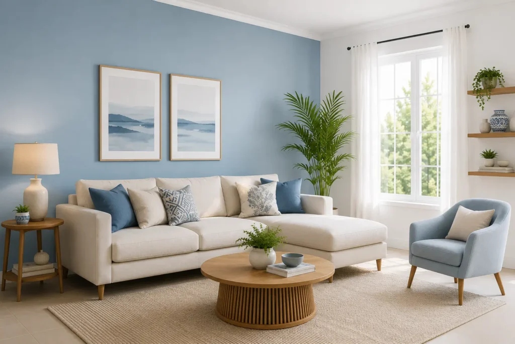
A timeless combination for bedrooms and bathrooms, soft blue calms the senses while white keeps the space bright. This pairing suits coastal or minimalist décor styles with light wood or white furniture.
5. Mustard Yellow Accent with Cream Base
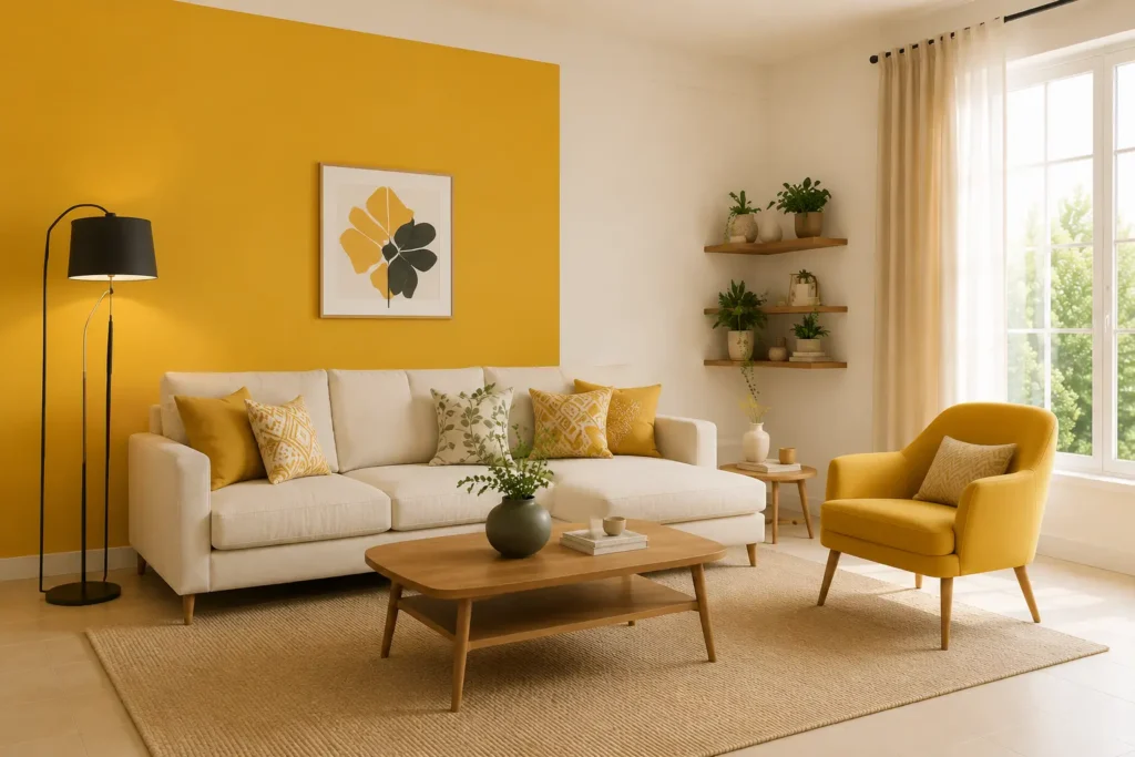
Mustard as an accent wall brings cheerful energy to dining rooms, kitchens, or children’s rooms, while a cream base keeps the overall look grounded and warm.
6. Dusty Rose with Warm Grey
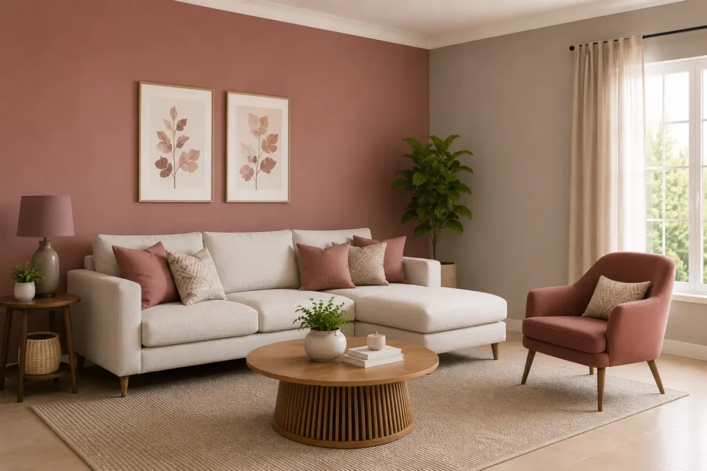
A gentle, sophisticated combination that suits bedrooms and reading corners. Dusty rose softens the room while warm grey keeps it from feeling overly feminine, working well with brass and wood accents.
7. Olive Green with Beige
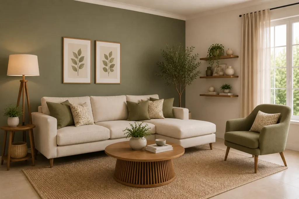
Olive green has become a strong modern wall colour trend in India, bringing a nature-inspired, grounded feel. Paired with beige, it suits living rooms and study spaces with leather or wooden furniture.
8. White and Wood Combination
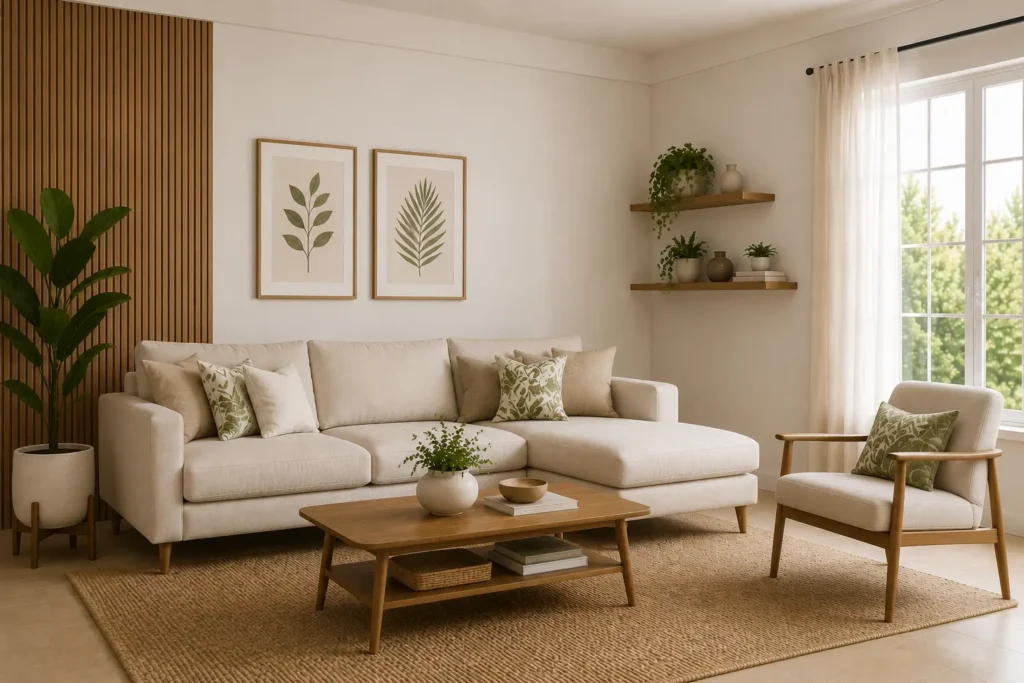
A clean, airy pairing where white walls let natural wood tones in flooring, furniture, or panelling take centre stage. Excellent for small apartments where visual lightness is a priority.
9. Navy Blue Accent with Soft Grey
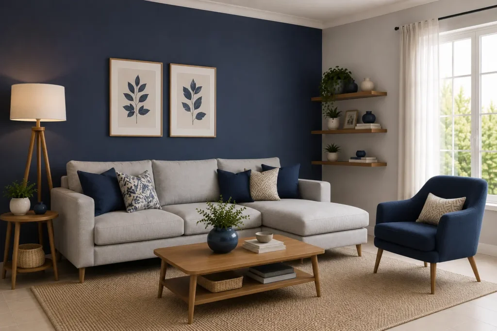
Navy as a single accent wall paired with soft grey on the rest creates a refined, slightly dramatic look, ideal for home offices or master bedrooms with metallic or brass décor touches.
10. Peach with Ivory
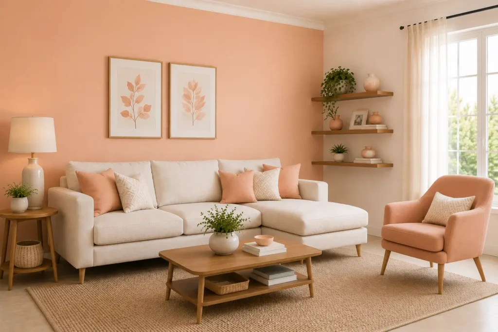
A warm, inviting pairing that suits bedrooms and living rooms in homes with a romantic or vintage aesthetic. Works beautifully with wooden furniture and soft textile layering.
11. Warm Taupe with Soft White
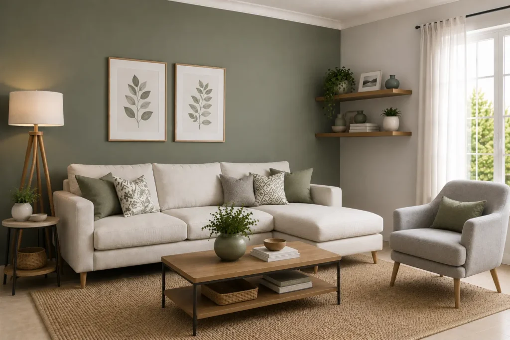
Taupe offers a sophisticated neutral base that pairs effortlessly with soft white trims, suiting both traditional and contemporary Indian homes.
12. Deep Forest Green with Cream
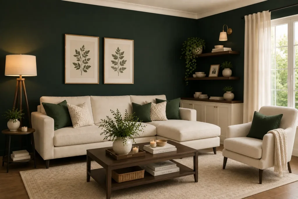
Olive green has become a strong modern wall colour trend in India, bringing a nature-inspired, grounded feel. Paired with beige, it suits A bold yet balanced combination for a statement living room wall, forest green paired with cream keeps the richness from feeling overwhelming, especially with brass or gold accents.
Room-by-Room Wall Colour Recommendations
Living Room: Living room wall colours often work best as warm neutrals, earthy tones, or a soft accent paired with white, since this is the space guests see first and it should feel welcoming yet stylish.
Master Bedroom: Bedroom wall colour combinations should lean calming, think soft blues, sage greens, dusty pinks, or warm greige, since the bedroom is meant for rest.
Children’s Room: Bright but not overstimulating shades like soft yellow, mint, or light coral work well, allowing room for playful décor without becoming chaotic.
Kitchen: Light, easy-to-clean colours such as soft yellow, white, or pale green keep kitchens feeling fresh and energised.
Dining Room: Warm tones like terracotta, mustard, or deep red as an accent encourage appetite and conversation.
Home Office: Muted, focus-friendly tones such as soft blue, sage green, or greige support concentration without feeling sterile.
Bathroom: Soft blues, sea greens, or crisp white work best, paired with moisture-resistant finishes.
Modern Wall Colour Trends in Indian Homes
Several wall paint ideas have gained strong popularity recently:
- Warm neutrals for understated elegance
- Earthy tones like terracotta and ochre for a grounded, homely feel
- Greige combinations that blend the practicality of grey with the warmth of beige
- Sage green, loved for its calm, nature-inspired appeal
- Soft blues, popular in bedrooms and bathrooms
- Terracotta accents, often used on a single feature wall
- White and wood combinations, especially in smaller apartments where light, airy interiors are preferred
Accent Walls, Textures, and Decorative Finishes
An accent wall is one of the simplest ways to add depth without overwhelming a room. A single bold or textured wall, paired with a neutral base on the remaining walls, creates visual interest while keeping the overall palette balanced. Beyond flat paint, consider:
- Textured finishes like lime plaster or limewash for an organic, handcrafted look
- Wallpapers with subtle patterns for bedrooms or study nooks
- Stencil work or geometric patterns for a personalised touch
- Wood panelling combined with paint for added warmth and texture
These elements work best when they complement, rather than compete with, your chosen wall colour combination.
Common Mistakes to Avoid
- Ignoring natural light: Always test paint samples in your own room at different times of day rather than relying on how a colour looks in a store or online.
- Following trends blindly: A trending shade may not suit your home’s existing style, furniture, or flooring.
- Overusing bold colours: Too many strong shades across multiple walls can make a space feel chaotic rather than curated.
- Skipping sample testing: Paint a small patch on the wall and observe it for a couple of days before committing to the full room.
Do’s and Don’ts for Choosing Wall Colours
Do:
- Test paint samples directly on your walls before finalising
- Consider how lighting changes through the day
- Choose a cohesive palette across connected spaces
- Balance bold colours with neutral tones
Don’t:
- Choose colours based on trends alone without considering your home’s character
- Use more than two or three dominant colours in one room
- Ignore the impact of flooring and furniture tones
- Rush the decision without testing samples first
How Professional Guidance Can Help
While these guidelines offer a strong starting point, every home has its own quirks of light, layout, and personal taste. An experienced interior designer can look at your specific space and help fine-tune a colour scheme that ties every room together cohesively, something that can be harder to achieve through trial and error alone.
Conclusion
Selecting the best wall colour combinations for Indian homes is about much more than picking a shade you like. It involves understanding your room’s lighting, size, furniture, and the mood you want to create.
Whether you lean towards calming soft blues, grounded earthy terracotta, or a clean white and wood pairing, the right combination will not only enhance how your home looks but also how comfortable and functional it feels every single day.
At Creative Interior & Decor, thoughtful colour planning is an essential part of creating interiors that reflect your personality while maximizing comfort and visual appeal. Take the time to test, observe, and choose thoughtfully, or work with the experts at Creative Interior & Decor, and your walls will reward you with a home that feels as good as it looks for years to come. Visit us at our local business location.